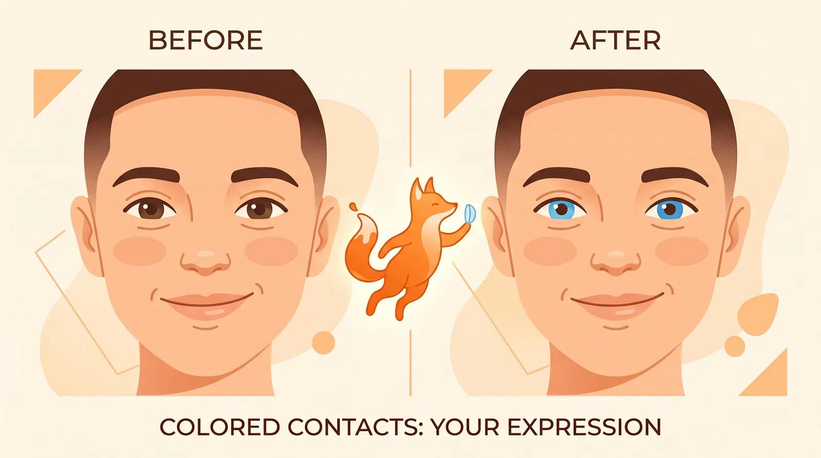
Colored contacts are almost impossible to picture before you buy. A swatch on a product page or a close-up of a stranger's eye tells you nothing about how a shade will read against your own iris, skin tone, and hair. A cool gray that looks striking on a model can look flat on you, and a warm honey can either light up your face or wash it out. You really have to see it on your eyes.
That is the gap an AI colored contact lens preview fills. You upload one selfie, pick a color, and the AI changes only your iris while keeping your face, skin, and lighting the same. Instead of guessing from a swatch, you see blue, green, hazel, or gray on you before you commit. This guide covers how to use it and, importantly, the safety steps that a preview can't replace.
This tool is a styling preview, nothing more. It shows you what a color might look like. It does not, and cannot, do any of the following:
- Confirm a lens is safe for your eyes or a correct fit for your cornea.
- Provide a prescription, a base curve, or a diameter.
- Replace an eye exam or a fitting with an optometrist.
Contact lenses are regulated medical devices in most countries. Even plano (zero-power) colored lenses require a valid prescription and a proper fitting, because the wrong fit can scratch the cornea or cause infection. Use this preview to choose a color you like, then see a licensed eye-care professional to get fitted and buy from a legitimate seller. Never share lenses, and never buy decorative lenses from an unregulated shop.
The AI can only recolor an iris it can read clearly. Open the colored contact lens preview and upload a photo that gives the model what it needs:
- Your eyes are open, in focus, and facing the camera. The iris is what the color maps onto.
- The shot is reasonably close, so the eyes take up enough of the frame to recolor cleanly.
- The light is even and natural. Soft daylight shows true color; harsh light blows out the iris detail.
- Nothing covers the eyes. Skip sunglasses, heavy glare on prescription lenses, or hair across the face.
A recent, sharp phone selfie near a window is plenty. The clearer the eyes, the more believable the color.
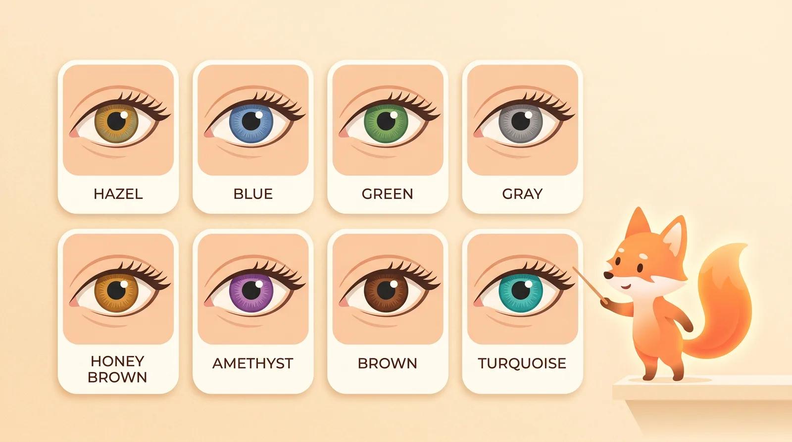
Choose a color reference. There is no prompt to write; the colors are pre-built, so you pick the shade instead of describing it. You get eight to compare:
- Hazel: warm brown-green blend.
- Blue: cool, bright, high contrast on dark eyes.
- Green: vivid, standout.
- Gray: cool, soft, subtle.
- Honey brown: warm, golden brown.
- Amethyst: violet, unusual.
- Brown: natural-looking enhancement.
- Turquoise: bright blue-green, bold.
Comparing colors is free, so run more than one. Try the two or three shades you are torn between on the same selfie and look at them next to each other.
Pick a color and run the preview. The model changes only the iris color while keeping your identity, the white of the eye, your skin, and the lighting stable. It takes a few seconds.
When it finishes, zoom in and check the details that tell you whether a color works on you:
- Iris only: the color should sit inside the iris, not bleed onto the white of the eye or the pupil.
- Natural edge: the rim of the iris should look soft and real, not like a hard colored disc.
- Highlights: the small catchlights in your eyes should stay, so the eye still looks wet and alive.
- Contrast with skin and hair: step back and judge the color against your whole face, not just the eye.
- Both eyes: the color should match across both eyes.
If something looks wrong, regenerate or try a different color instead of keeping the first pass. A sharper, better-lit selfie fixes most issues.
Color choice is mostly about contrast with your natural eye and how bold you want to go. Use this as a starting point, then let the preview confirm it on you.
| Lens color | Tends to suit | Effect |
|---|
| Brown | Most eyes | Natural enhancement |
| Honey brown | Dark eyes, warm skin | Warm, subtle lift |
| Hazel | Light-to-medium eyes | Soft, multi-tone |
| Gray | Cool skin tones | Understated, cool |
| Green | Dark and light eyes | Vivid, eye-catching |
| Blue | Dark eyes, high contrast | Bright, dramatic |
| Turquoise | Bold looks | Standout, costume-ready |
| Amethyst | Bold looks | Unusual, statement |
The general rule: if you want a natural change, stay within a shade or two of your own color; if you want a dramatic one, pick a color that contrasts your eye. It is a guideline, not a law. Seeing the shade on your eyes is what settles it.
The difference between a preview you can trust and one you can't comes down to the source selfie. A few things matter most:
- Use a sharp, in-focus shot where the eyes are clear and close enough to recolor.
- Shoot in even, natural light so the color reads true rather than washed out.
- Look toward the camera so both irises are fully visible.
- Judge the color against your skin and hair, not in isolation, before you decide.
If every result looks off, the fix is almost always a better source photo, not more attempts.
You can upload a selfie, pick a color, and generate a preview on the free model without an account. Comparing the eight colors costs nothing. Signing in removes the export watermark from your download, so the saved image is clean and ready to share.
You don't have to guess a colored-contact shade from a swatch. Upload one clear, well-lit selfie, compare a few colors on your own eyes, and find the shade you like, then get fitted properly before you buy.
Try the free colored contact lens preview →
")
")

")