
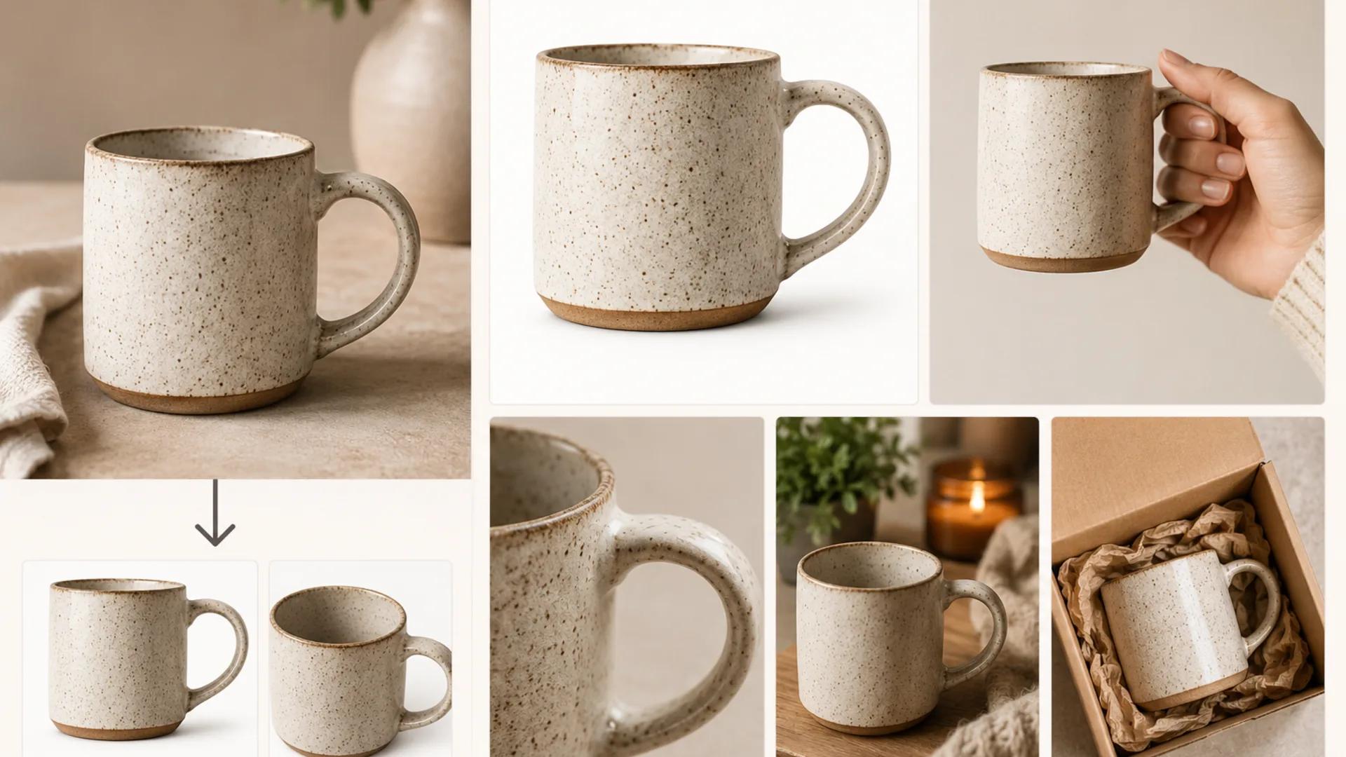
How to Create Etsy Listing Photos With AI That Help Buyers Decide
A practical workflow for turning one real product photo into a full Etsy listing set with AI, while keeping shape, color, materials, and handmade variation accurate.

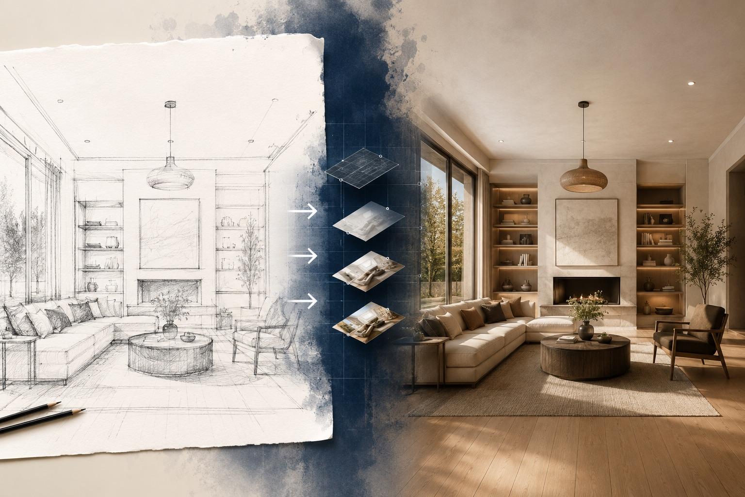
A practical guide to AI sketch to image: prepare pencil drawings, line art, or screenshots, write prompts that respect your lines, and fix the common failures.
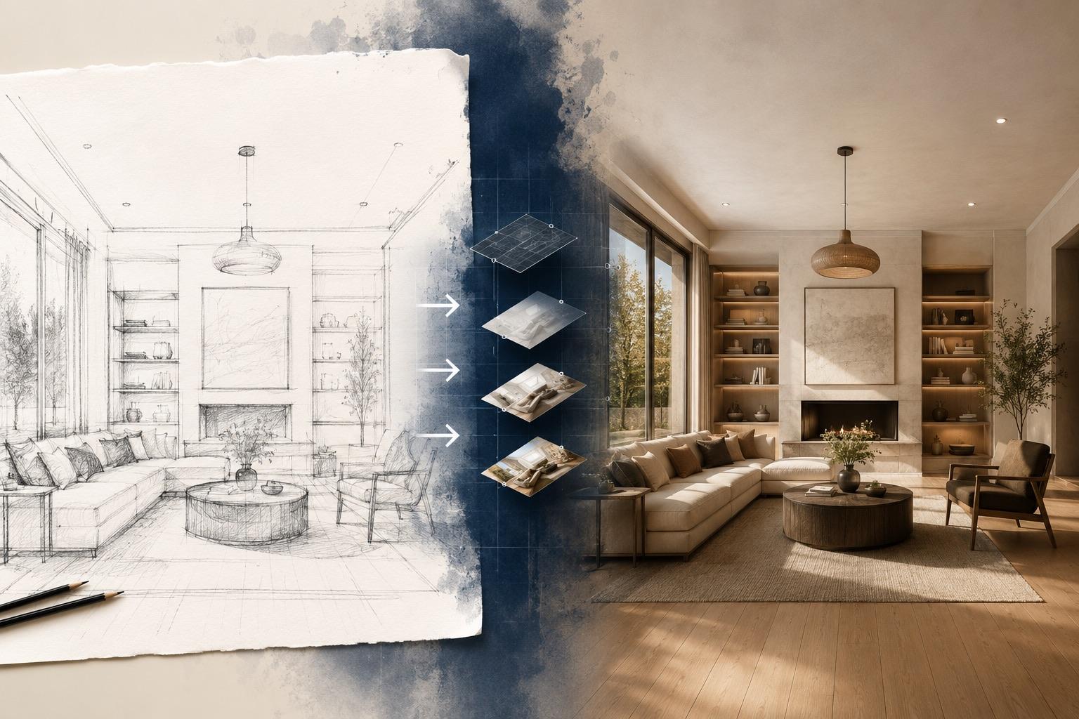
You have the idea on paper. A chair profile, a room layout, a character pose, a packaging shape, a UI wireframe. The drawing communicates fine in a meeting, and it falls apart the moment someone asks for something they can show a client, post to a feed, or drop into a deck. Rendering it properly takes time, and commissioning it may not fit an early concept stage.
AI sketch to image closes that gap. You feed in the drawing you already made, describe the material, lighting, and style you want, and get back a finished-looking visual built on your lines.
To turn a sketch into an image with AI:
Most first attempts miss on one specific thing: material, background, or angle. Fix that one thing in the prompt rather than rewriting from scratch.
The model reads your drawing as structural guidance — where the edges are, roughly what shape things take, how the composition is arranged — and generates a new image that follows that structure while adding everything the sketch left out: surface texture, color, shading, depth, background, and lighting.
That last part matters. The output is a generated interpretation, not a rendering of your drawing. The AI is not calculating what your object would look like if it existed. It is producing something plausible that fits your lines and your description. Two things follow from that:
For mood boards, concept exploration, and pitch visuals, that's exactly what you want. For anything that will be manufactured, built, or presented as a factual representation, treat the output as a starting sketch of a sketch and verify it against real drawings.
Input quality does more for the result than prompt cleverness. Three common starting points, each with its own prep.
The main enemies are uneven light and low contrast.
If your sketch has margin notes and dimension callouts, crop them out or expect them to reappear as garbled text-like marks in the output.
This is the easiest case. Vector exports, inked digital drawings, and CAD line views all give the model unambiguous structure.
Screenshots of wireframes, floor plans, and layout mockups work, with one caution: they are full of labels, placeholder text, and interface chrome, and the AI will try to interpret all of it.
Go to AI sketch to image for drawing-to-visual work. If you're transforming an existing photo or render rather than a line drawing, image to image is the better fit. If you have no drawing at all and want to explore shapes first, start with text to image and come back once you have a direction.
Use the cropped, contrast-corrected version, not the raw camera roll shot.
Describe the finished image, not the drawing. See the formula below.
Put the output next to your original sketch and check three things specifically: Did the silhouette survive? Did the proportions hold? Did anything appear that you didn't draw?
If the material is wrong, fix the material words. If the composition shifted, that's usually an input or interpretation problem, not a wording problem. Changing five things at once makes it impossible to learn what worked.
When you have a version you like, run it through the AI image upscaler if you need it larger for print or presentation.
Weak prompts describe the drawing. Strong prompts describe the photograph or illustration you wish existed. Use this order:
Subject and form → material and finish → lighting → background and setting → style and medium → what to avoid
Naming the medium is the single highest-impact addition most people skip. "Product photo," "watercolor illustration," "architectural render," and "3D clay model" send the output in completely different directions from the same sketch.
Mid-century lounge chair matching the sketched profile, solid walnut frame with visible grain, tan leather cushion with subtle creasing, soft diffused daylight from the left, plain light grey studio background, product photography, shallow depth of field. Keep the original silhouette and leg angle. No text, no additional furniture.
Two-storey residential building following the drawn elevation, board-formed concrete and warm cedar cladding, black window frames, overcast afternoon light, simple lawn and low planting in the foreground, architectural visualisation style, straight-on camera angle. No people, no cars, no signage.
Standing character in the drawn pose, teal hooded jacket and dark trousers, cel-shaded anime illustration with clean flat colour, soft rim light from behind, plain pale background, keep the inked outlines. No extra characters, no background text.
Cylindrical cosmetic jar matching the sketched proportions, frosted glass body with a matte white lid, blank label area with no lettering, soft studio lighting with a gentle reflection on the surface below, neutral beige background, clean commercial product shot. No visible text, no brand marks, single object only.
Notice that examples 1 and 4 explicitly ask for no text. That's deliberate — see the troubleshooting section.
Every image-to-image workflow involves a tradeoff between fidelity to your input and quality of the finished render. Pushing the AI to reinterpret more heavily gives you richer materials, better lighting, and more polished output — and it drifts further from your lines. Holding it close to your sketch preserves your composition and gives you something that looks more like a colored drawing than a finished photograph.
Rather than chasing a specific setting or number, work it as a practical loop:
The most reliable habit: generate several variations from the same sketch, keep the one closest to your intent, and refine from there. Sketch-to-image work is iterative by nature, and expecting one perfect result on the first pass mostly leads to frustration.
Your object moved, rotated, or got recomposed. Common causes include faint input lines, distracting elements in the crop, a prompt that describes a different angle than the sketch, or asking for too much reinterpretation. Fix the input first — darken the contours, crop tighter — and add explicit language like "keep the drawn angle and proportions."
Edges came back smeared, or fine detail dissolved. Usually a low-resolution or low-contrast upload. Rescan larger, increase contrast between the ink and the paper, and thicken hairline strokes. If your original is genuinely small, upscaling it before uploading sometimes helps the model read the structure.
You drew one chair and got a chair plus a side table plus a rug. Generative models fill empty space. Two fixes: state the count explicitly ("single object, nothing else in frame") and describe the background you do want, so the model has somewhere to put its impulse to add. Naming the background is more effective than only listing what to exclude.
AI-generated lettering can be misspelled or nonsensical, and this shows up frequently in packaging, signage, and UI work. Don't fight it — design around it. Ask for a blank label area, generate the visual, then add real typography in your design tool afterward. That also gives you correct brand fonts.
Distorted fingers, asymmetric features, and off expressions can still occur. If a face or hand is central to your image, draw it more carefully in the sketch, keep it larger in frame, and generate more variations than you would otherwise. Also be clear-eyed about identity: if your sketch is of a specific real person, the output will not reliably resemble them. AI does not preserve identity from a drawing.
The common pattern: these are all decision-making and communication artifacts. They help people agree on a direction. They're not the deliverable.
Before you send an AI-generated visual anywhere:
No. It follows your structure as guidance, and small shifts in proportion, perspective, and detail are normal. Cleaner, higher-contrast lines improve fidelity, but exact geometry isn't something a generative model guarantees. If measurements matter, use the output for look and feel only.
You can, and it works better than people expect for exploration — but the rougher the input, the more the AI invents. A loose scribble gives you inspiration; a considered drawing gives you your idea rendered.
That's your call, and you should state it in the prompt. "Keep the inked outlines" produces an illustrated look. "Photographic finish, no visible outlines" removes them entirely. Left unspecified, results vary between generations.
Color in the input influences the output, sometimes strongly. If your sketch has color you don't want carried through, either say the colors you do want explicitly or work from a grayscale version of the drawing.
Generation involves randomness. Different runs produce different images. This is useful — generate several and pick — but it means you should save any result you like immediately rather than assuming you can reproduce it.
Once you have a still you're happy with, it can serve as a starting frame for motion work. Browse all Inkfox tools to see what's available.
No, and treating it as one causes problems. It's fast concept visualization. A professional render is built from accurate geometry and can be trusted for specification, fabrication, and client sign-off. Use AI to decide what to render properly.
The useful framing isn't "AI finishes my work." It's that the distance between a sketch and something you can show someone just got much shorter. Draw the idea, render a few directions, pick one, and take that into whatever tool actually produces the final asset.
Start with a clean scan and a specific prompt, generate more than one option, and check the result before it leaves your desk.
A practical workflow for turning one real product photo into a full Etsy listing set with AI, while keeping shape, color, materials, and handmade variation accurate.
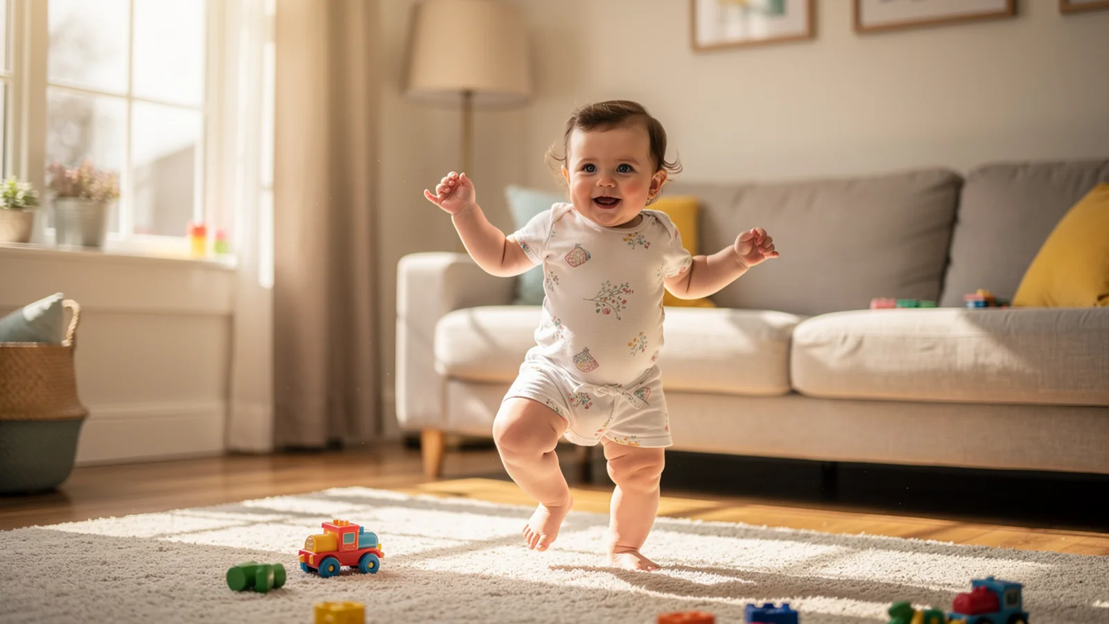
A repository-backed Seedance 2.0 image-to-video guide using three exact prompts, source frames, five-second outputs, and bounded visual observations.
Learn how to design a tattoo with AI from concept to artist brief. A step-by-step Inkfox workflow for prompts, styles, revisions, and building a reference your tattoo artist can actually use.
Newsletter
Subscribe to our newsletter for the latest news and updates