

How to Make a Logo With AI for Free (No Designer, Step by Step)
A practical step-by-step guide to make a logo with AI for free: pick a style, write a logo prompt, generate clean brand marks, and get a usable result.

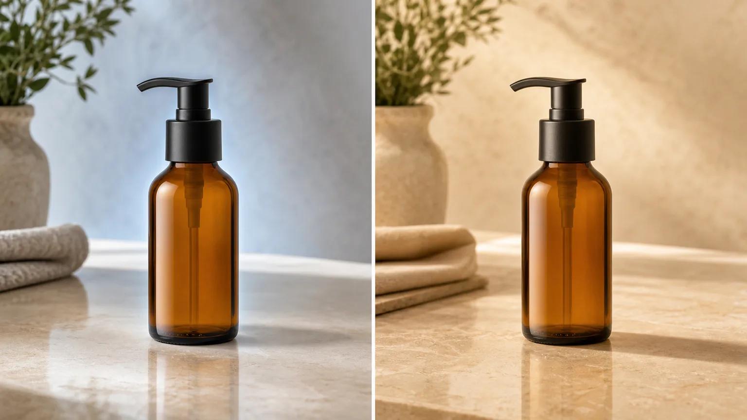
Repair unrealistic product-photo backgrounds by checking perspective, color temperature, contact shadows, edges, reflections, and batch consistency.
An AI background replacement can be technically clean and still look fake. The cutout may have no obvious missing pixels, yet the product floats, leans against the scene, glows around its edges, or reflects a room that no longer exists.
The fastest repair is not to keep adding style words. Diagnose the physical mismatch, fix the source or prompt responsible for it, and regenerate only when the composite cannot be corrected cleanly.
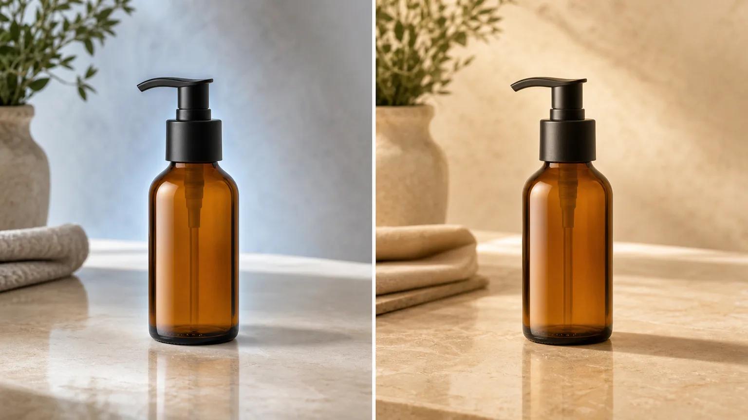
Open the result and source side by side at 100% zoom. Then ask which layer is wrong: camera, light, contact, edge, or reflection.
| Symptom | Likely cause | First repair |
|---|---|---|
| Product seems tilted or too large | Perspective or horizon mismatch | Match camera height and surface lines |
| Product looks blue in a warm room | Color-temperature mismatch | Match background light to source light |
| Product floats | Missing or diffuse contact shadow | Add a tight shadow at the contact point |
| Pale/dark fringe around outline | Old background contamination | Recut from the source or refine edge colors |
| Glass/metal shows the old room | Reflection mismatch | Rebuild reflections or choose a simpler scene |
| One image in a batch feels different | Inconsistent prompt, crop, or grade | Compare against an approved reference frame |
If several defects appear together, start again from the best original. Repeatedly editing a low-resolution cutout compounds halos, blur, and color contamination.
Perspective sets the camera's location. If the product was photographed from slightly above, you should see some of its top surface. Placing that cutout into a background photographed from countertop height creates an impossible viewpoint.
Check three things:
In the background changer, describe the camera as well as the room:
Preserve the product and its exact viewing angle. Replace the background with a warm limestone vanity photographed from the same slightly elevated camera height, 50 mm product-photo perspective, level vertical lines, realistic scale, uncluttered scene.
If the source uses an extreme wide-angle view, a neutral studio or abstract backdrop is safer than a geometric interior full of straight lines.
A background does not merely sit behind a product; it supplies the light that should appear on it. A cool product highlight in a sunset-orange scene breaks that relationship.
Trace the brightest highlight and darkest shadow on the product. The new background needs a plausible source in the same direction. Then match the broad temperature:
| Source product light | Compatible background direction | Avoid |
|---|---|---|
| Soft cool daylight | north-facing window, overcast studio | orange spotlight from opposite side |
| Warm hard light | late-afternoon window, warm studio beam | flat cool office light |
| Broad front light | large frontal window or softbox | dramatic backlit scene |
| Mixed reflective light | restrained studio with controlled highlights | complex neon or mirrored room |
Do not force a cinematic room onto a flat catalog source. Choose a scene whose light can explain the highlights already present.
Color-managed review matters because displays interpret color profiles. Apple's technical note on color management explains how source profiles and destination displays affect representation. For a web delivery workflow, keep the profile embedded and inspect the export in the browser and on a second device rather than trusting one editor view.
The contact shadow is darkest and tightest where the product touches the surface, then softens with distance. A large uniform blur beneath the whole object reads as a drop-shadow effect, not light.
Check:
Prompt the relationship, not just the word “shadow”:
Keep the bottle resting directly on the stone. Add a short, soft contact shadow attached to the base, darkest at the contact point and feathering away to camera right, consistent with a large window on the left.
If the generator keeps floating the object, make a clean cutout with the AI background remover and composite the final contact shadow in an editor. That is often faster than accepting a fourth random regeneration.
Edge defects usually come from the old background, not the new one. A product photographed on white may retain a pale matte when placed in a dark room. A dark studio source may leave a gray rim against a bright replacement.
Inspect these zones separately:
Do not apply one global blur. Hard package corners need crisp geometry, while translucent glass may need partial scene color through the edge. If the halo is widespread, return to the original and create a new mask. If it appears in one small area, local decontamination is enough.
Reflective products carry their environment on their surface. Glass, chrome, glossy plastic, and polished packaging can reveal the old lightbox even after the background is gone.
Ask:
For a highly reflective object, use a simple studio background with broad lights that resemble the original setup. Complex interiors, checkerboard windows, and neon signs require a true relighting/compositing pass; background replacement alone may not be enough.
| Situation | Best action | Why |
|---|---|---|
| Clean product, wrong background mood | Regenerate background | Subject pixels are still trustworthy |
| Small edge halo or weak shadow | Repair locally | Faster and more controlled |
| Wrong viewpoint or impossible scale | Regenerate from a better-matched scene | Geometry controls the whole composite |
| Label, shape, or product color changed | Reject and return to source | Product identity is compromised |
| Glass/metal reflects the old set everywhere | Reshoot or do a full composite | Environment is embedded in the subject |
| Source is blurry or clipped | Reshoot | No background can restore missing evidence |
If you regenerate, change one variable at a time. A useful sequence is camera match, then lighting, then surface/contact, then decorative styling. This preserves the cause-and-effect signal.
A single repaired image can pass while the collection still looks inconsistent. Make a contact sheet with identical thumbnail sizes and review rows rather than files.
| Review pass | Compare across every image | Fail condition |
|---|---|---|
| Geometry | Product height, angle, silhouette | Product appears to change shape |
| Color | Product color and neutral balance | Same SKU shifts noticeably |
| Grounding | Contact point and shadow density | Some products float |
| Edge quality | Halos, clipping, translucency | Fringes become visible at listing size |
| Scene family | Palette, materials, prop density | One frame belongs to another campaign |
| Export | Pixel dimensions, crop, compression | Mixed ratios or visibly damaged details |
Google's product image specification requires the image to accurately display the product and sets restrictions for primary listings. Its additional-image guidance allows staging and contextual views, so keep the accurate catalog image as the anchor and use repaired lifestyle scenes as supporting assets.
Before publishing, add meaningful text alternatives to informative images. W3C's guidance on informative images recommends conveying the meaning or information, rather than mechanically listing every visible detail.
The safest background replacement keeps the product fixed and changes only what the camera would have seen behind and around it. Start with perspective and light, then repair contact, edges, and reflections. Styling comes last.
A practical step-by-step guide to make a logo with AI for free: pick a style, write a logo prompt, generate clean brand marks, and get a usable result.
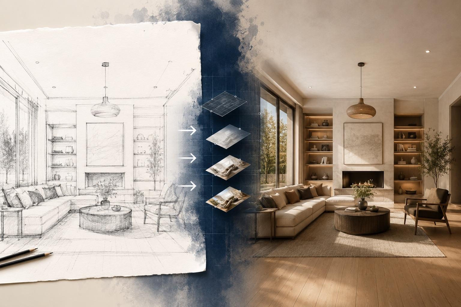
A practical guide to AI sketch to image: prepare pencil drawings, line art, or screenshots, write prompts that respect your lines, and fix the common failures.

How to turn a phone selfie into a professional headshot for LinkedIn, resumes, and team pages with free AI: which selfie to use, how to pick a style, and how to check the result still looks like you.
Newsletter
Subscribe to our newsletter for the latest news and updates